Creating the New GUP Logo
The Designer's Perspective
This guest post is from Ryan Seslow, an artist, illustrator, graphic designer, and a professor of digital art and design living and working in NYC. Ryan identifies as Deaf and Hard of Hearing. As a visual / digital artist, Ryan can be found often working with a synthesis of applied arts (drawing, painting, and sculpture), new media, animation, and digital and Internet-art. Seslow shows his work both on and off the web. As a professor of Digital Art and Design, Seslow teaches courses in studio art, digital art, graphic design, design thinking, new media, digital storytelling, and communications technology for graduate and undergraduate level programs in NYC. He is an associate professor currently in his 20th year of college level teaching. As a graphic designer, front end web designer, illustrator, and animator, Ryan offers a variety of design services, and specializes in working with new, small, and medium sized businesses, as well as one-on-one with individuals.
![]()
I am excited to share the new Gallaudet University Press logo and rebranding! First and foremost, it is important to share that this process was 100% collaborative. I was very lucky to have the opportunity to work with Angela Leppig and Katie Lee at GUP! Katie originally reached out to me as a result of seeing the rebranding and logo that I created for the St. Francis de Sales School for the Deaf here in my home NYC borough of Brooklyn. I was immediately excited about the project and we jumped in.
A rebrand is a big deal! New logos, typefaces, and color stories communicate that the business or organization has made important changes, and wants to continue to best serve, connect, and provide value to their audience and customers. GUP was indeed ready to take on the update and made the process so pleasurable. We began with a great rapport of introductions, and I got to understand where GUP evolved from, where they are going, and who they serve. We started with a traditional design brief, which included a series of questions that identified several key pieces of user, customer, audience, and consumer information and statistics. It is crucial to know who you are designing for, and what problems you will solve as a result. The design brief helps place ourselves into the shoes of their audience. GUP is a part of Gallaudet University, which has a rich history, pride, and legacy as a deaf and hard of hearing cultural institution. The words “history,” “pride,” “accessibility,” “inclusion,” and “legacy” were strong terms that would lead the way in crafting the logo’s imagery.
GU already displays a strong logo and brand identity. This includes their icon, fonts, color palette, and style guide. The university’s branding guidelines were a helpful reference to draw from as it was the priority of the press to ensure their logo and visual identity complimented the overall brand of the university. Collectively we quickly agreed that the emphasis was to be placed on legibility and accessibility. I believe that this formula leads to the creation of a timeless yet modern design. We delved into a series of developmental sketches to visualize several ways that we could communicate GUP as both a text logo with the name, as well as a word-mark with an icon or element that would connect viewers to both GUP and GU. Again, the emphasis was placed on legibility and accessibility. This means that the full name of GUP would scale both larger and smaller while retaining its integrity.
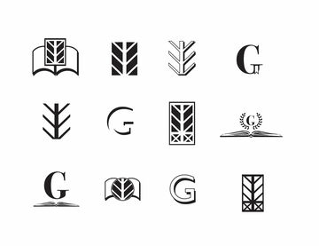
My process as a designer is very iterative. I believe it is important to exercise all of the impressions, impulses, and flows of creativity. This helps to rule out all of the things that will not work. Having this energy exercised helps me know the contrast experientially and place myself in the shoes of the viewer. This also breaks the designer free of the pressure or expectation to get things “right” immediately.
Photograph courtesy of Gallaudet University Archives
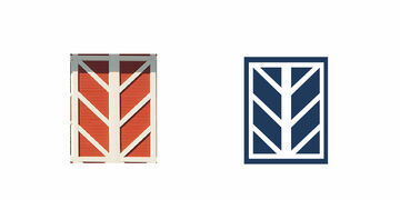
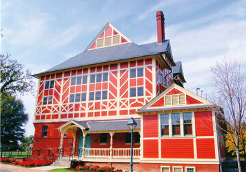
We then began applying some of the sketched icons, graphics, and potential elements into the GUP text logo. We were able to rule out several examples that played on the letter“G,” along with several variations of the “GUP” letter characters. The biggest breakthrough in this process came from Katie, who submitted to me an image of the architectural design taken from the facade of the Peikoff Alumni House, or “Ole Jim” as it is affectionately known, on the GU campus. GU has a huge, prideful community of alumni. The symbolism of this graphic was a direct connection to GU community members far and wide, and an invitation to those making contact with GUP. I quickly rendered the design element as a vector graphic and composed it to the left of various typefaces we had landed on to use as part of the GUP brand. It was from here we decided to place a focus on the use of a high contrast color format. Using the GU navy blue, both the inverted and primary versions worked beautifully.
In the end….
![]()

Comments